Kentucky Fried Chicken Touch-less Kiosk System
Contribution: System Design, Kiosk Exterior Design, Static Screen Strategy.
KFC Kiosk
The IT, In-Store Experience team and I were tasked with concepting and pitching next-gen kiosk designs for KFC’s in-store experience.
This project included :
Creating digital screen applications for current kiosks.
Creating an adaptive system for graphics and product UI.
Working with the vendors on specific dimension needs, and understanding limitations on the manufacturing side.

System Design
Round 1
Through collaborating with the Dev Team as well as our vendor, we ruled out designs that would cost more, so that the design would be the most efficient and financially responsible for the organization.
After aligning on three key design directions we started getting more granular on the logistics of the screens and the Experience of the Kiosk related to the menu vision and layout.
We collaborated on priority, and I was able to come up with a system to use for each image that would ensure consistent expectations for our menu items.

Exterior Design
Round 1
Through collaborating with the Dev Team and our vendor, we aligned on the design that was the most efficient and financially responsible for the organization. After aligning on three key design directions we started getting more granular on the logistics of the screens and the Experience of the Kiosk related to the menu vision and layout.

No More Finger Lickin’
This project was scoped to deploy in early 2020.
Midway through the quarter, the COVID-19 pandemic hit, and in-store restrictions had de-prioritized the external kiosk design.
We had to immediately pivot digital implementation. We aligned to supporting a more pick-up friendly approach, using the screens as a trust signal to ensure a safe touch-less experience.

System Design
Round 2
The biggest consideration for the pivot was ensuring that people had enough space to feel comfortable reading the kiosk screens, even when other people may be in the store waiting for their food.
I created a system that would allow for each Kiosk to be read, with six feet distance between each user. This not only complied with CDC guidelines but also allowed showed our user’s safety was our number one priority.
This was executed by utilizing our brand tone to “disarm” the anxiety of our users going into the store. The southern comfort of our brand tone allowed us to play off the idea of personal space being important while also clearly communicating that certain Kiosks are not to be approached.
The focus now was primarily to use the Kiosks as a touch-less digital board that would give our users an indication of where to go for their food. This was achieved by using copy in the design to tell the user where to pick up their order in-store, eliminating the steps needed for them to get their food.
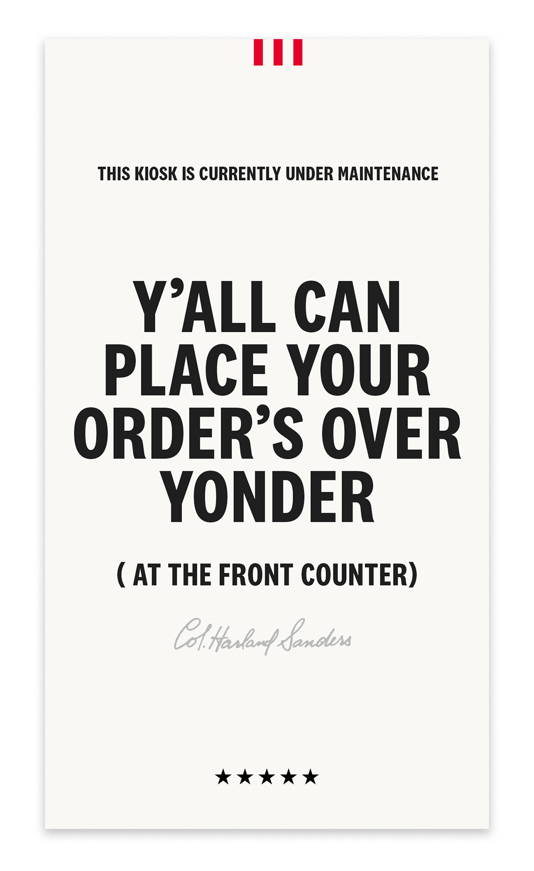
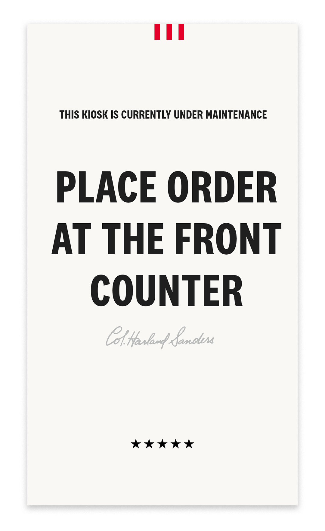
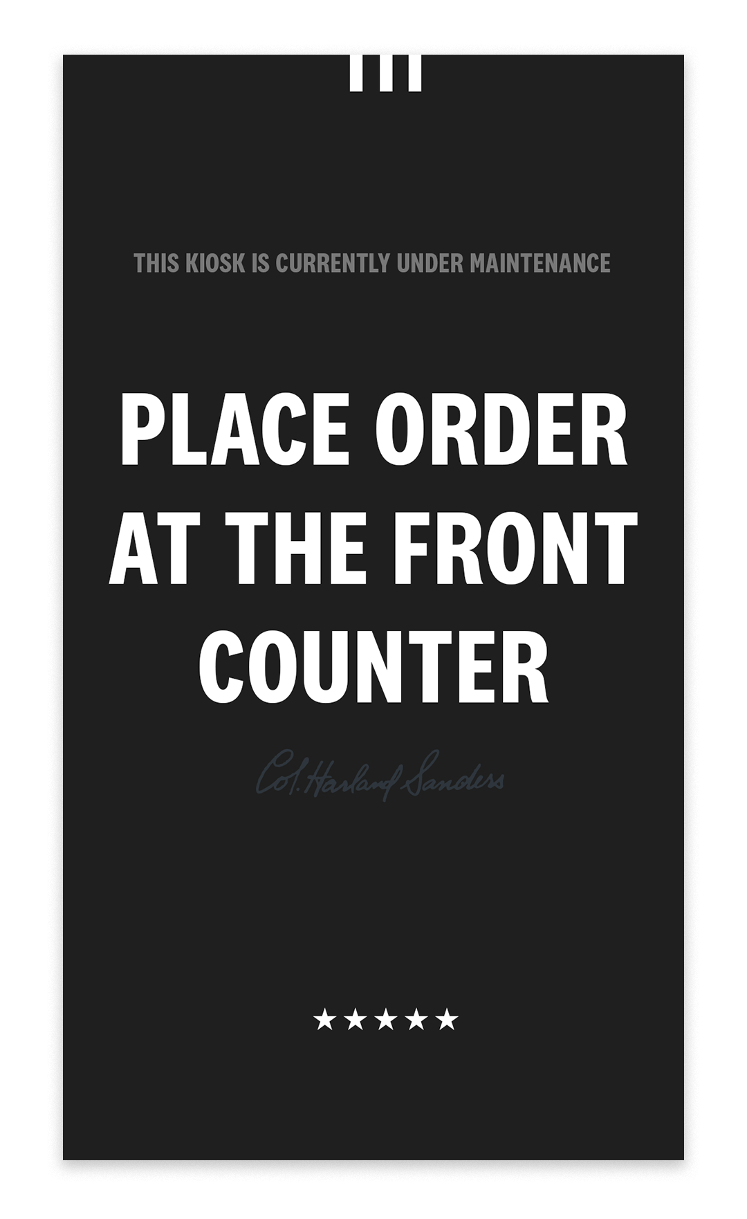
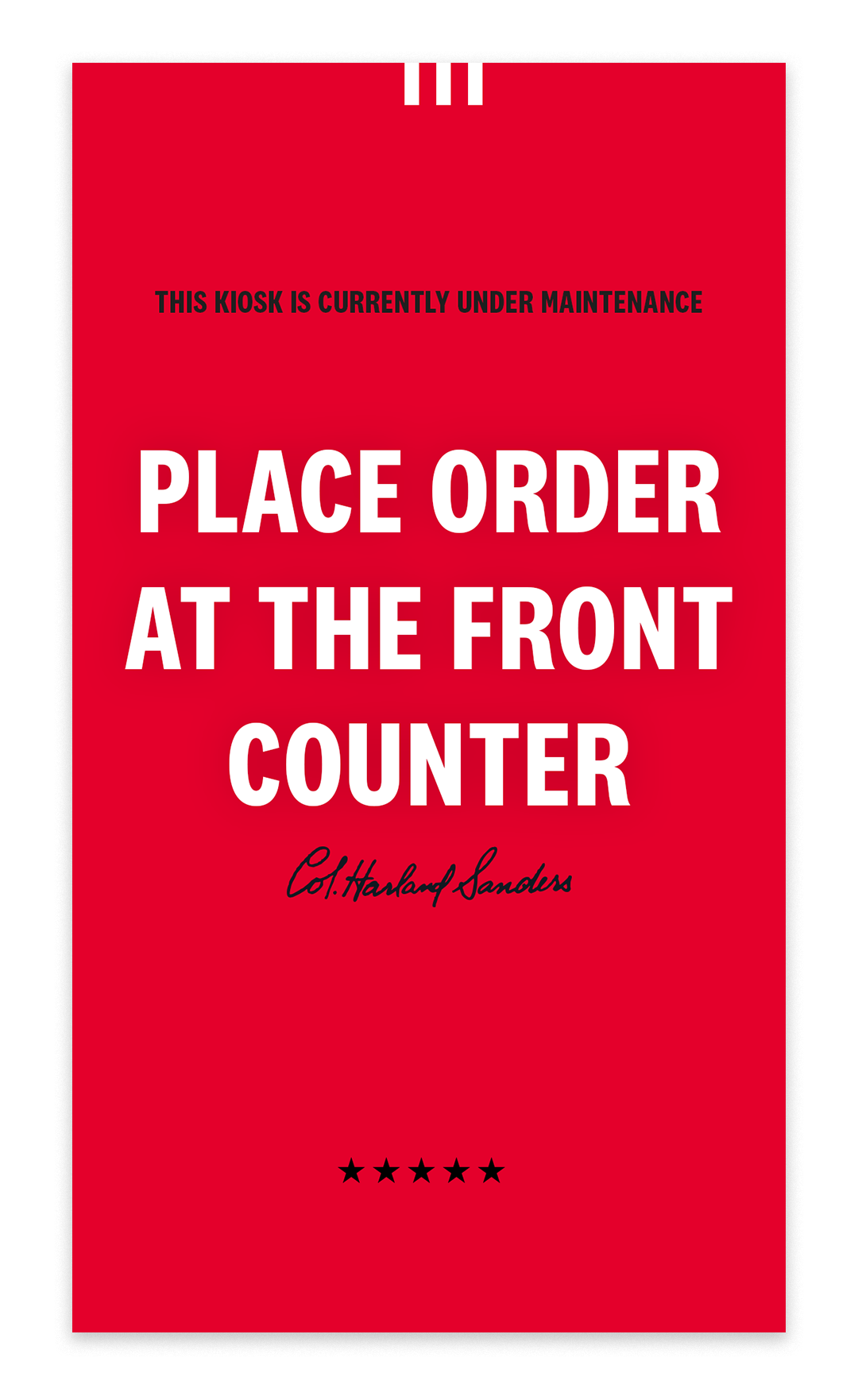
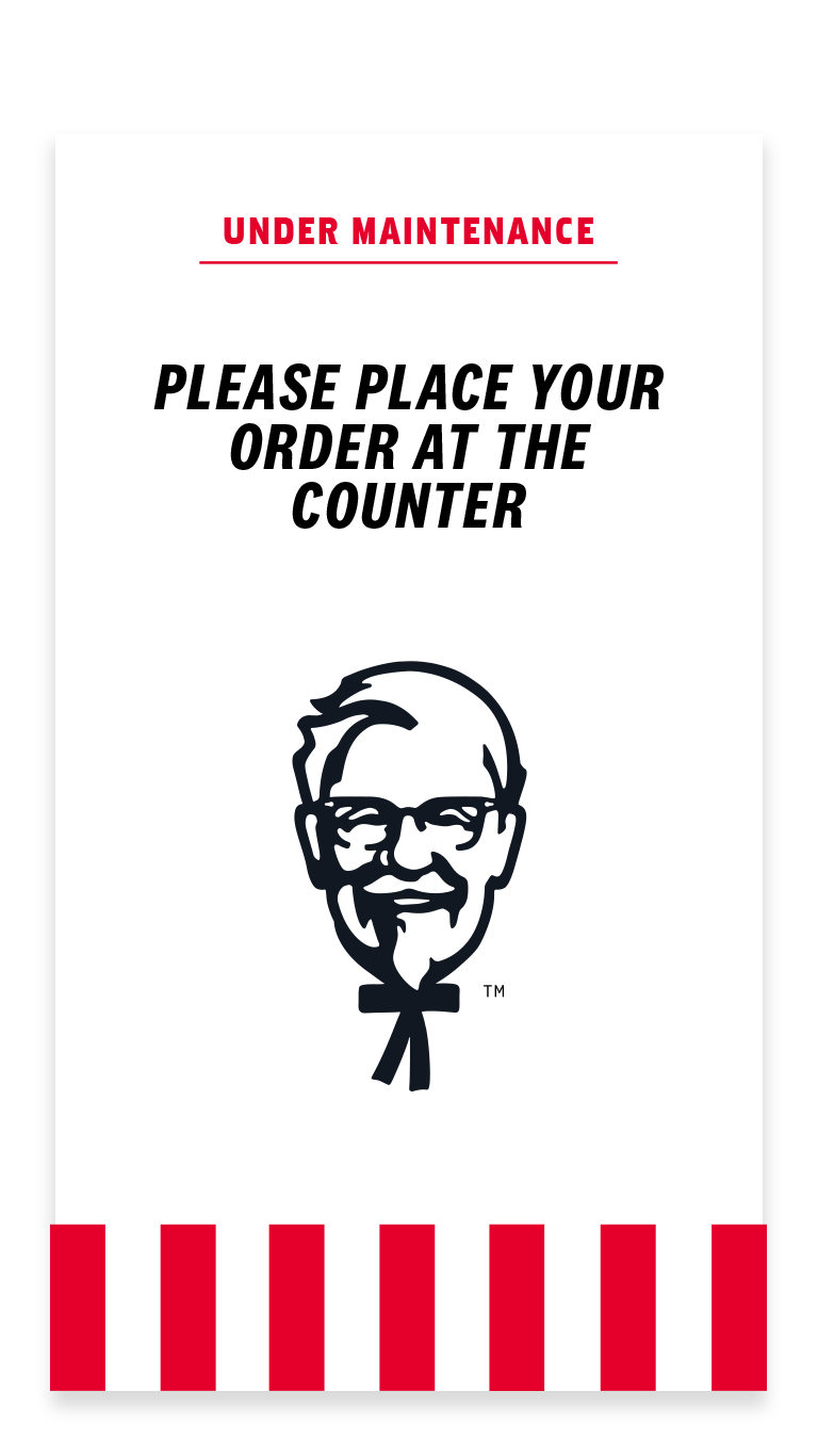
With the design of the screens for wayfinding, there also came the need for updates on default screen states for when the kiosks are undergoing maintenance or not available at certain franchise locations.
