KFC Menu Vision
Contribution: System Design, UI Design, Development, Research, Analysis, Testing.
Why revisit our menu?
KFCs menu spanned well past our in-store experience. Our digital presence across different aggregates needed a standard to share with our partners at Grubhub, Doordash, Postmates, and Uber eats. This standardization not only provided brand consistency but served as a process simplification for widespread menu changes so that updated images could be changed and populated globally with minimal partner involvement.
Project needs :
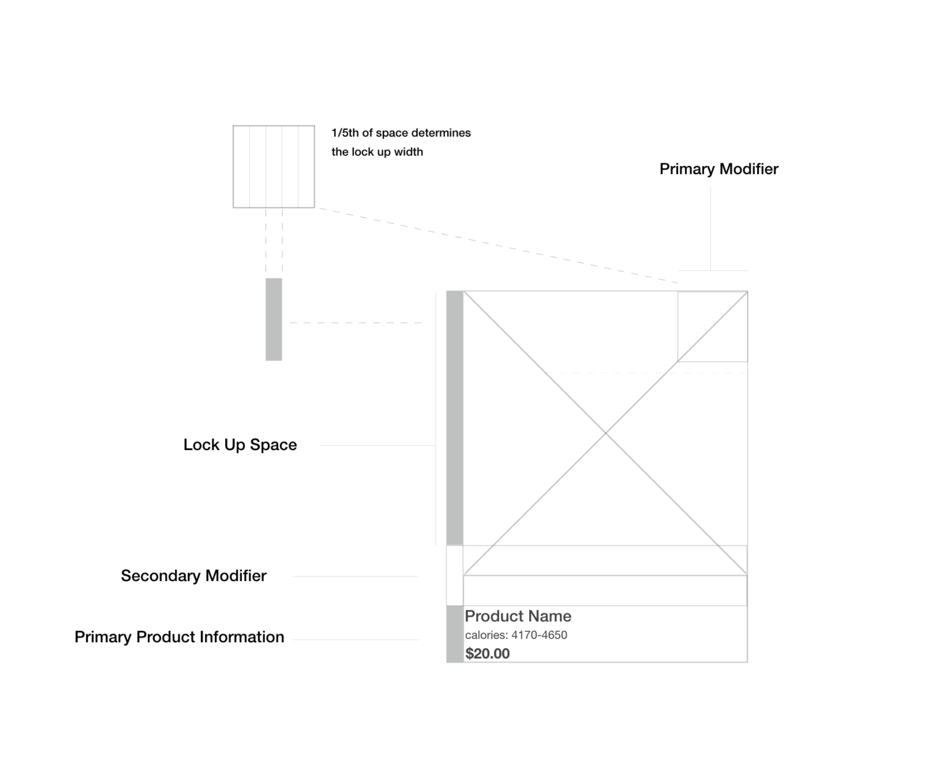
Restructure and propose a system to update and modernize our current KFC menu display to match our evolving brand identity, defining deliverable specs and restrictions for each partner to create a streamlined product image refresh process.
Client: Kentucky Fried Chicken.
Audience: Audiences looking to order KFC product on Grubhub, Doordash, Postmates, and Uber eats.
Team: I worked as the sole designer on the KFC IT Performance Marketing team. All work shown is my own. I collaborated with the Tech team, aggregate stakeholders to implement this system.
Brief: Restructure our KFC Menu system to convey key information as users decide on a product, and develop edge cases for a realized end to end visual experience. propose a new scalable design system that would educate and excite users about new products as well as clearly indicate new product offerings.
Challenges: Email testing, ADA Compliance, New Brand Implementation, Working with Internal IT teams to design and build a working HTML structure that would provide a consistent viewing experience. Working with external stakeholders to test code in different email providers’ inbox environments to find, test, and solve issues with compression and code redactions. Proposing an entire visual email system in a new digital team for an established iconic brand that is known for being “old fashioned”….. no pressure.
Goals: To create an adaptive menu system that allows for interchangeable UI elements that indicate modifiers and product information. Above all, create a system that builds trust with our aggregate partners and end users.
Solution: I designed an entire visual system, in collaboration with our tech team that worked backwards from common partner complaints and user complaints. This included new brand asset development, to allow for a brand-consistent and trustable user experience for our audience outside platforms that we own and operate directly.
Aligning on a template base
The first step in building this system was starting with the basic foundational elements. The project needs to bring the brand into the market with competitor research, which through competitive analysis proved that there was a strong need for simplifying our brand trust signals.
Visual exploration
In proposing this system we wanted to consider variants to evolve our visual system. Specifically looking at ways to hit at piece count and product modifier information on a high level scan such as white, dark, and variety chicken buckets. I also explored ways of introducing a new flag to hit at new flavor builds and product launches to differentiate new recipes from original. Its important to note that the UI is more informational all leading to the same experience.
Sauce modifier system
Social links are a great way to link to other campaigns currently in our market. My team and I created this system so that even if we decided to highlight another social channel such as TikTok we could still have a system.
While this project was handed to another team to uphold, I hypothesize that this documentation served as a brand standards increasing brand awareness and consistency across all of our partner platforms. I was able to use this to have future-state conversations with tech stakeholders on informing our in-store digital experience menu layout.
This process informed future collaboration handoff documentation with aggregates.


